My name is Jeffrey Warren
I design maps, visual programming environments, and other stuff at the MIT Media Lab's Design Ecology group, and as a fellow in the Center for Future Civic Media. Email me at warren@mit.edu

GrassrootsMapping.org »
Tools and techniques for participatory grassroots mapping, emphasizing subjective and narrative mapping as a form of expression. By using low-cost tools like kites and balloons along with inexpensive digital cameras and mobile phones, communities can explore, document and assert their own local geographies. We are developing a map-making curriculum for kids and digital tools to publish grassroots maps in standard formats such as KML, Shapefile, and GeoJSON.

Cartagen.org »
Cartagen is a set of tools for mapping, enabling users to view and configure live streams of geographic data in a dynamic, personally relevant way. These tools helps users to analyze and view collected and shared geographic and temporal data from multiple sources. The framework uses vector-based, context-sensitive drawing methods to describe data, not merely in terms of lines and polygons, but also with adaptive use of color, movement, and projection. Applications include mapping real-time air pollution, citizen reporting, and disaster response.

NEWSFLOW »
NEWSFLOW is a dynamic, real-time map of news reporting, which displays both the latest top stories as well as the news organizations which covered them. All articles are from the last few minutes. Viewing news in this way lets us see how the choice of 'top stories' by news bureaus is geographically unequal, or rather, what areas of the world are neglected by various national news sources. Built with HTML5 on the dynamic mapping framework CARTAGEN, NEWSFLOW draws on real-time data from over 200 news organizations as well as Google, Yahoo, and other sources.

WHOOZ.org »
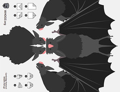
WHOOZ is a project to map urban wildlife in realtime with SMS messages throughout Manhattan, the Bronx, and Cambridge, MA. Users can request realtime 'safaris' to find animals recently seen near their current location.

ARMSFLOW.org »
ARMSFLOW is a data visualization which displays arms transactions globally between 1950 and 2006. It includes 14,619 arms transactions (each is a sum of 1 year's exports) and 228 government entities.
Kogbox.com »
Kogbox is a communal programming site where users write short re-usable snippets of code and run them in the cloud. Snippets can be shared and combined to create more complex applications.

Coffee Analytics »
A project mapping the flow of coffee on global, urban, local, architectural, biological, and personal scales. The full collection includes over 50 pieces on cardboard, paper, and chipboard in ink, paint, graphite, chalk, charcoal, and coffee.
Other work:
I'm a partner at Vestal Design, where I've done lots of stuff like Xobni's user interface and branding and information design for ClimateCounts. I also taught information design workshops for General Electric and Tata Consultancy Services in Mumbai.
I work occasionally and excitedly with Natalie Jeremijenko as part of her xDesign Lab at NYU.
Weardrobe is a site for tagging and organizing clothing online, which I created with Suzanne Xie and Richard Tong.
Cut&Paste Labs was founded by Diego Rotalde and me; we taught workshops on web design and development in Lima, Peru. Some went on to found their own firms:
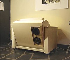
I've also designed a few zany things which people have enjoyed, like the DoubleSpace Kitchenette:

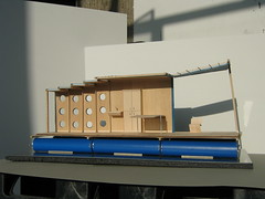
as well as the SHRIMP Refugee Shelter (with Alice B. Philips):

